
Kate Sparkle
Kate Sparkle is an emerging digital artist based in Brighton, UK. Her practice focuses on visual storytelling through bold colours and expressive compositions, drawing inspiration from the vibrant and powerful energy of comic art.
Working in a dynamic, semi-realistic style, Kate explores emotions, atmosphere, and the relationship between people and their surroundings.
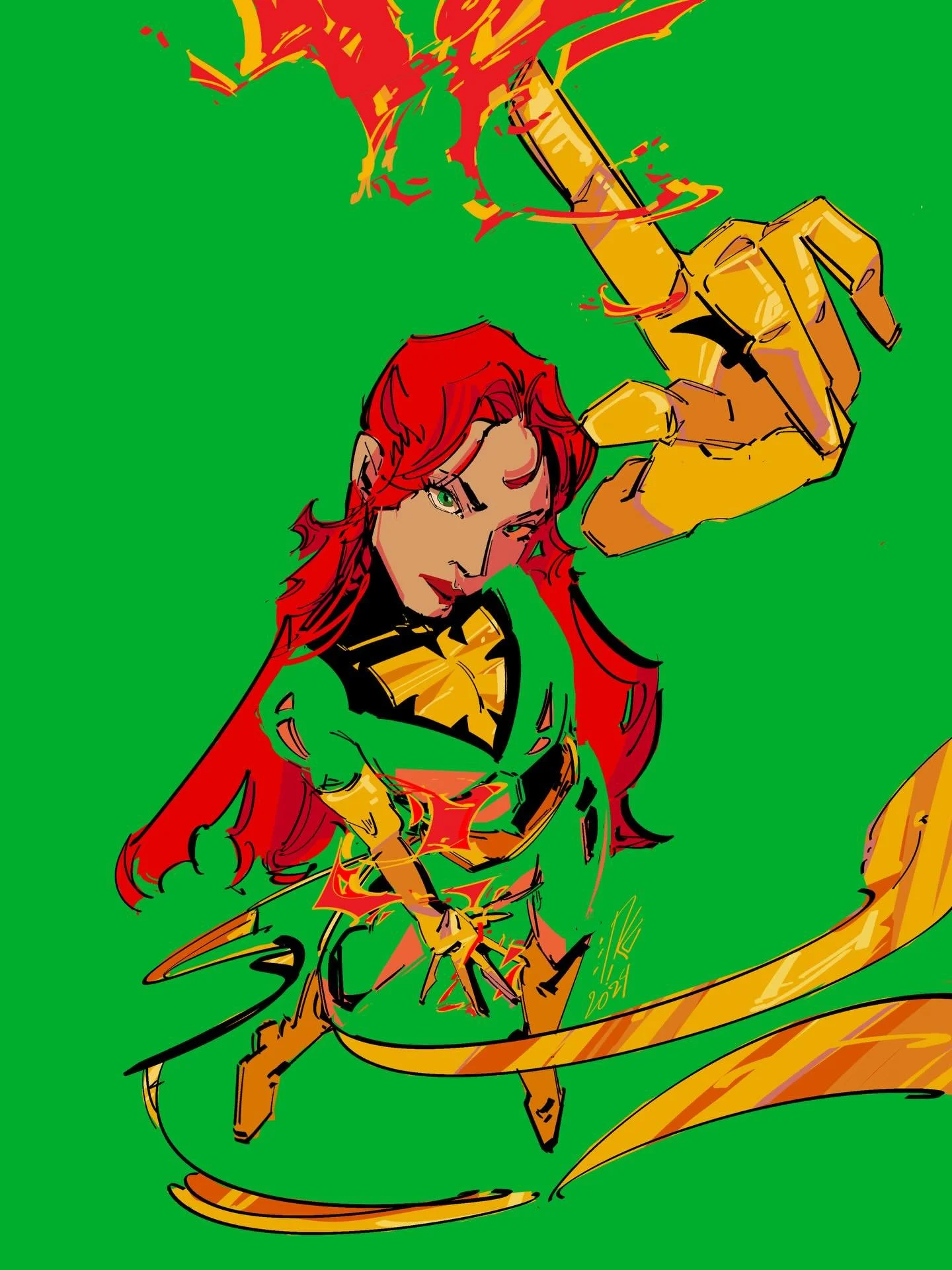
“I believe contrast is key to creating an engaging artwork.”
— Kate Sparkle
Can you tell us a little about yourself and how you discovered your passion for digital art?
I have been drawn to digital art and animation since childhood. I still remember my very first drawing tablet and the feeling of discovering digital drawing for the first time. I fell in love with it immediately. There was an overwhelming surge of creativity when I realised that the digital medium offered limitless possibilities for translating imagination and creativity into images.
What captivated me most was the freedom — the sense that an idea in my mind could become something tangible through experimentation, persistence, and curiosity. I never had formal art training or support in pursuing art, thus being able to learn and master the craft on my own was very special to me. In many ways, teaching myself was not simply a necessity, but it became a part of how I came to understand my own artistic voice.
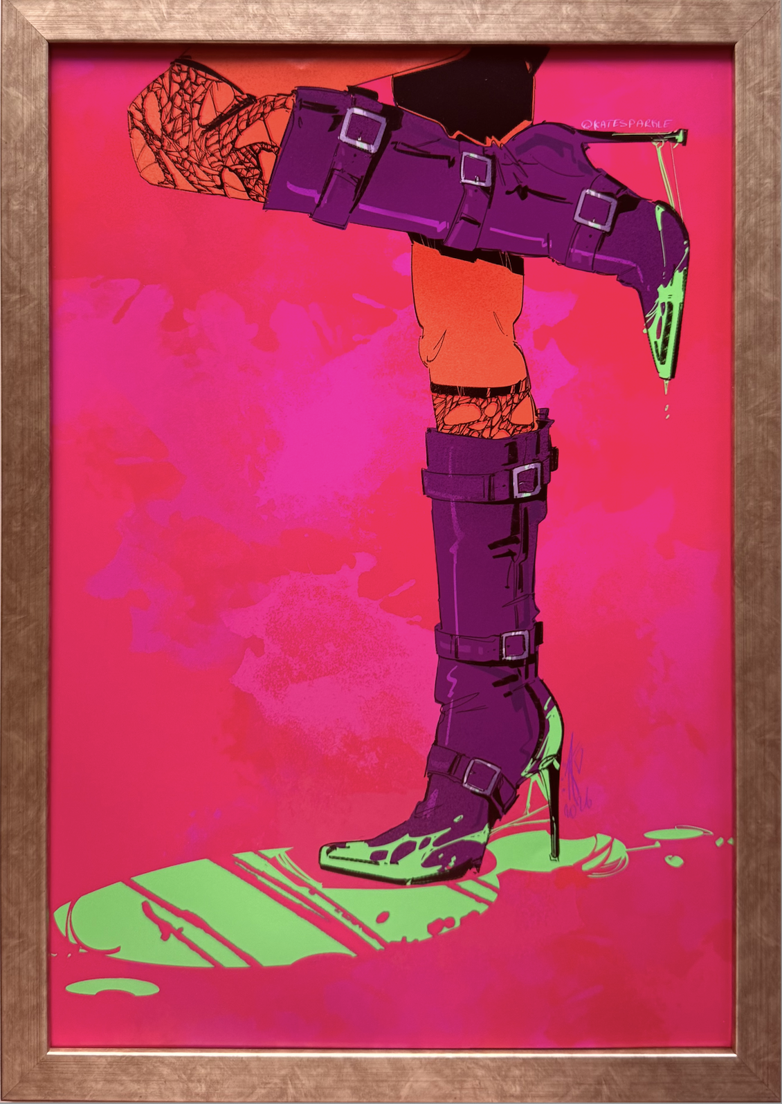
Toxic
Digital illustration
A3 — 29.7 × 42 cm / 11.7 × 16.5 in
Style: Dynamic Semi-Realism
Year: 2026
What first attracted you to the visual language and energy of comic art?
The visual storytelling in iconic comics like X-Men has always been a big inspiration for me. I was always fascinated by comic books, and especially the covers. I believe that they have an incredible capacity to capture a story with no words, relying only on art, details, and composition.
I am also deeply drawn to the distinctive use of linework, particularly the iconic black outlines that have become such an important part of the visual identity of comics. These lines give the image rhythm, structure, and character.
Your work combines bold colours with expressive compositions. What role does colour play in telling the story of your artworks?
I use bold lines and a lot of black linework, thus the rest of the colours have to be vibrant so the black does not overshine it. Colour for me is a storytelling tool; it sets the mood for the whole painting.
Subconsciously, every person has emotions attached to colours. For example, red is associated with anger and danger, contrary to blue, which many usually associate with calm or sadness and melancholy. I use those mental predispositions to cultivate distinct emotions and anchor the overarching tone of the whole painting.
You describe your style as semi-realistic and dynamic. How would you describe your artistic style in your own words?
I would describe my style as bold, colourful and emotional. I use colour theory, composition and subject matter to bring these elements together, combined with comic-like linework that helps me express my feelings and intentions to the viewer.
I like my work to feel energetic and expressive, while still leaving room for the viewer to discover their own interpretation.
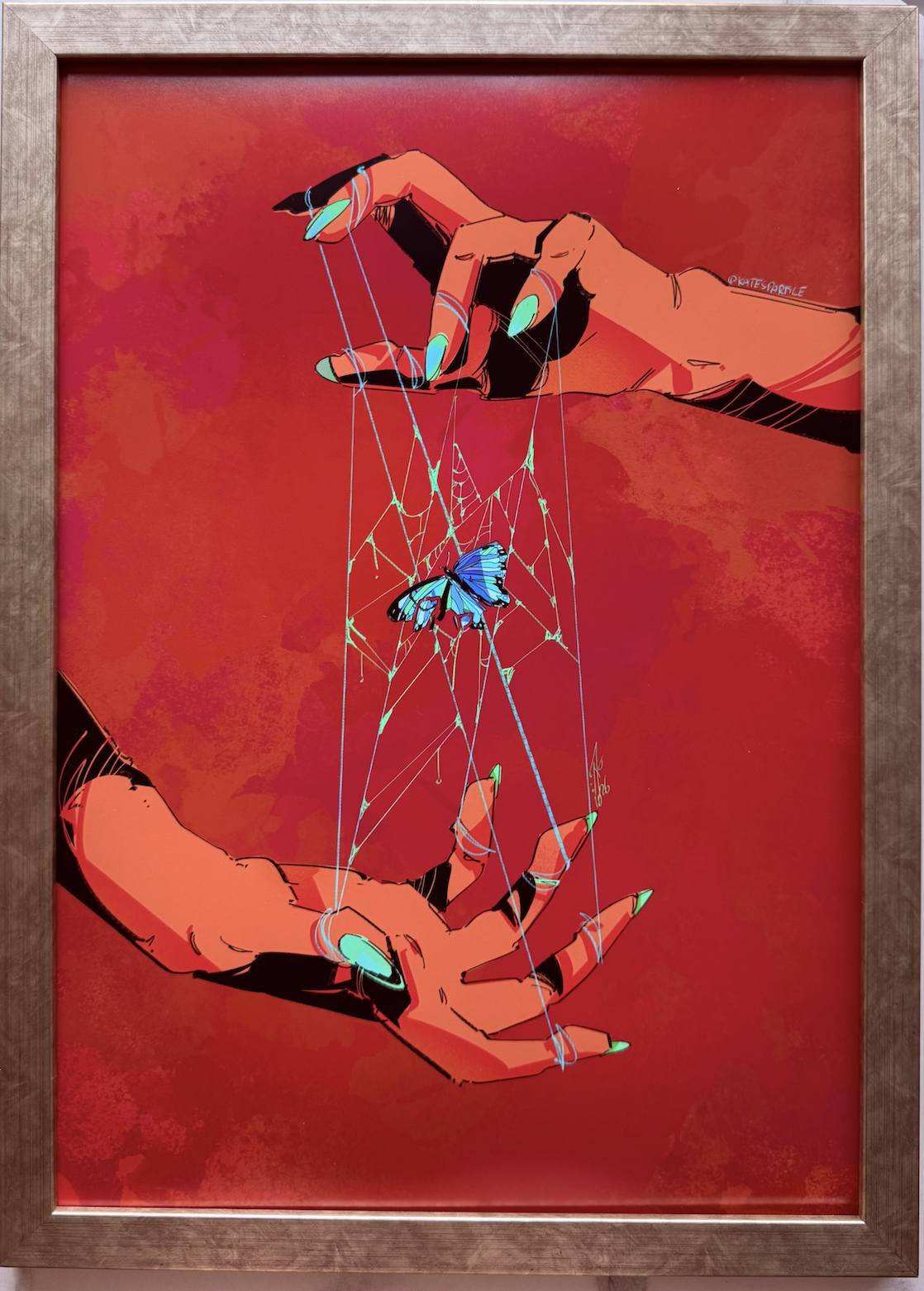
Trapped
Digital illustration
A3 — 29.7 × 42 cm / 11.7 × 16.5 in
Style: Dynamic Semi-Realism
Year: 2026
Your artworks often explore emotions and atmosphere. Is there a particular emotion you hope the viewer experiences when looking at your work?
An emotion I try to embrace the most in my art is joy and amusement, occasionally followed by sadness. At first, the viewer sees the bright colours, which the brain associates with happiness, but with a closer look into my artwork, the viewer often discovers the tricky subject matter, like a trapped butterfly or broken glass.
I create this contrast to allow the artwork to reveal something different beneath its initial sense of happiness.
You also explore the connection between people and their surroundings. What fascinates you about this relationship?
What fascinates me about people and their surroundings is the contrast between them. I enjoy placing soft colours and delicate environments alongside sharp hand gestures, or surrounding soft and vulnerable features with a harsh environment.
I believe that these contrasts can reveal something about how people experience and respond to the world around them.
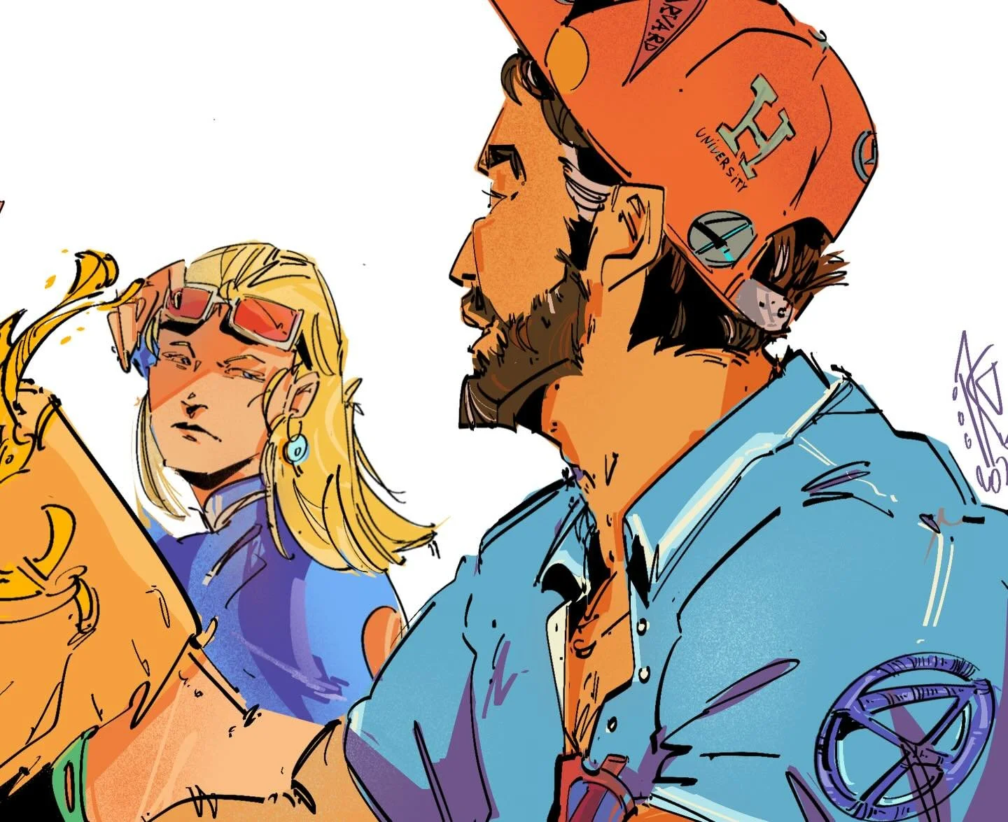
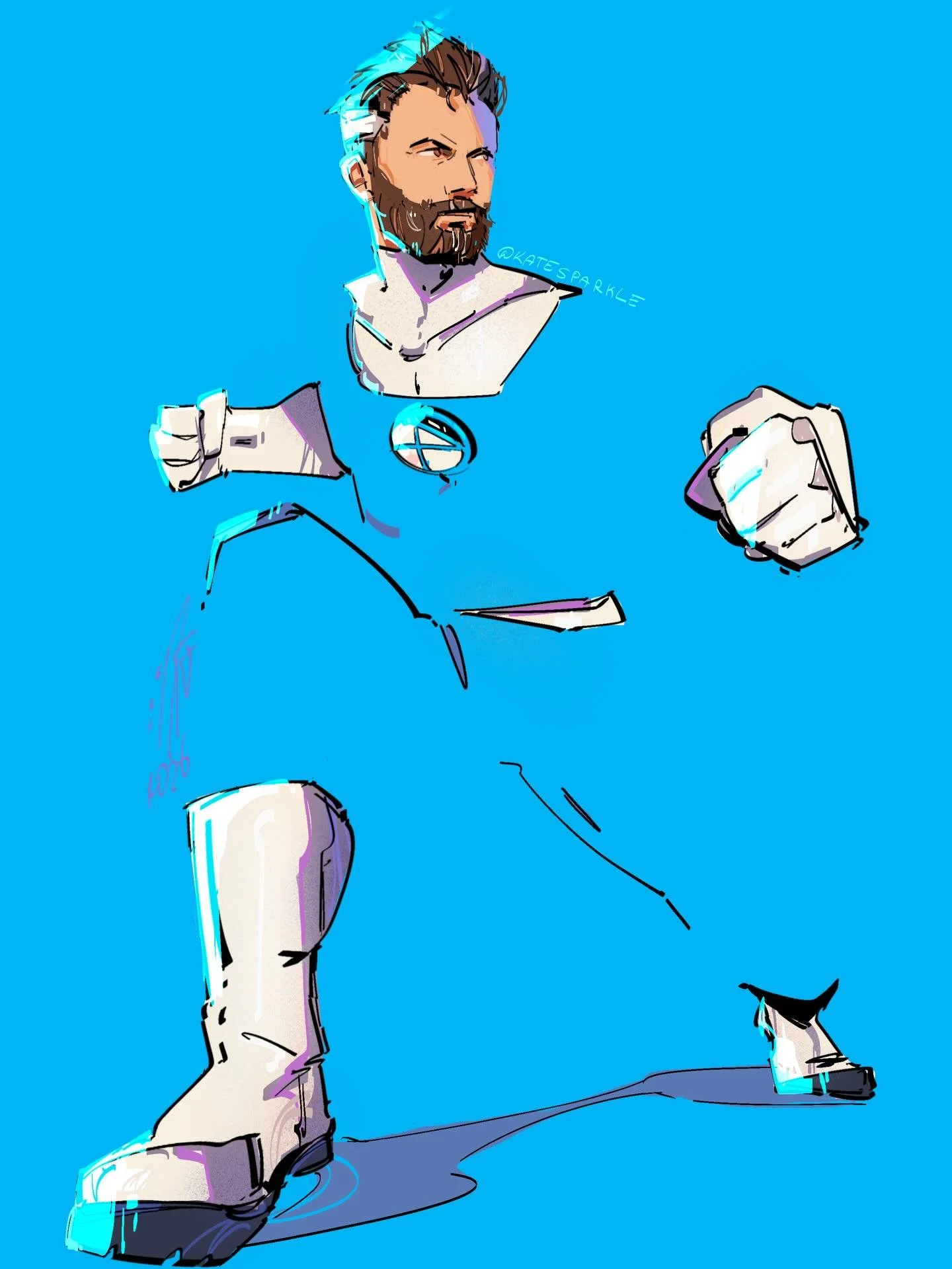
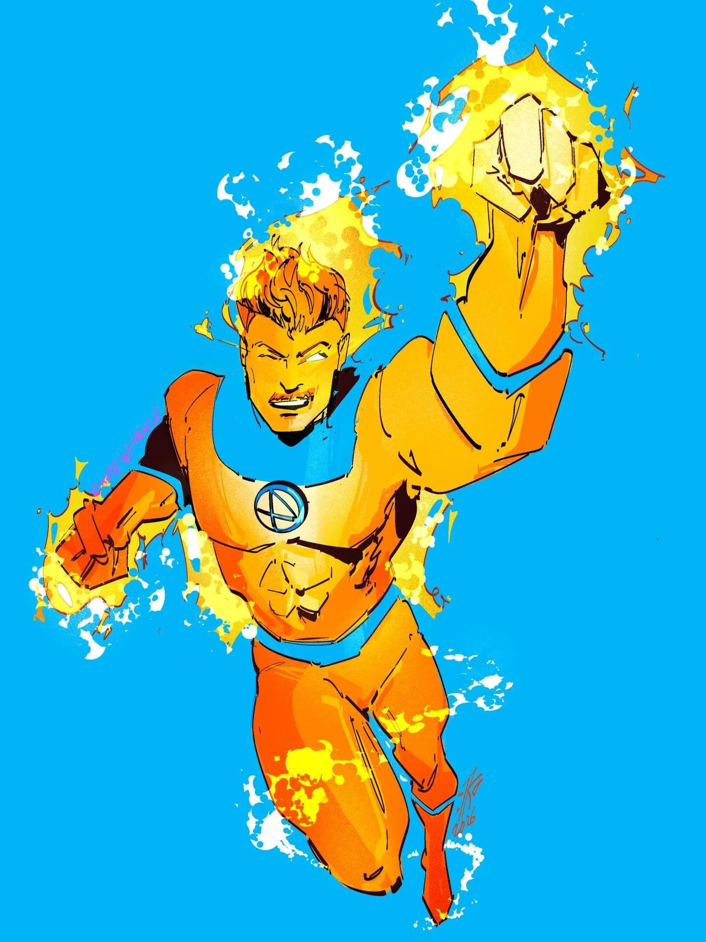
When you start creating a new artwork, what usually comes first—the story, the emotion, the character, or the visual composition?
Whenever I start a new artwork, the composition and subject matter usually come first. From there, I develop the linework and use colour to express the emotions I want the piece to convey.
I believe contrast is key to creating an engaging artwork, so I always consider how the different elements complement or contradict one another, like when the colour of the background is drawing the attention away from the main subject.
Are there any artists, comic books, films, or other forms of visual culture that have had a strong influence on your work?
The comic and animation work by Gigi Cavenago has always been a big inspiration for me, especially the Dylan Dog series. I am drawn to the way he combines expressive characters, atmosphere and strong visual storytelling.
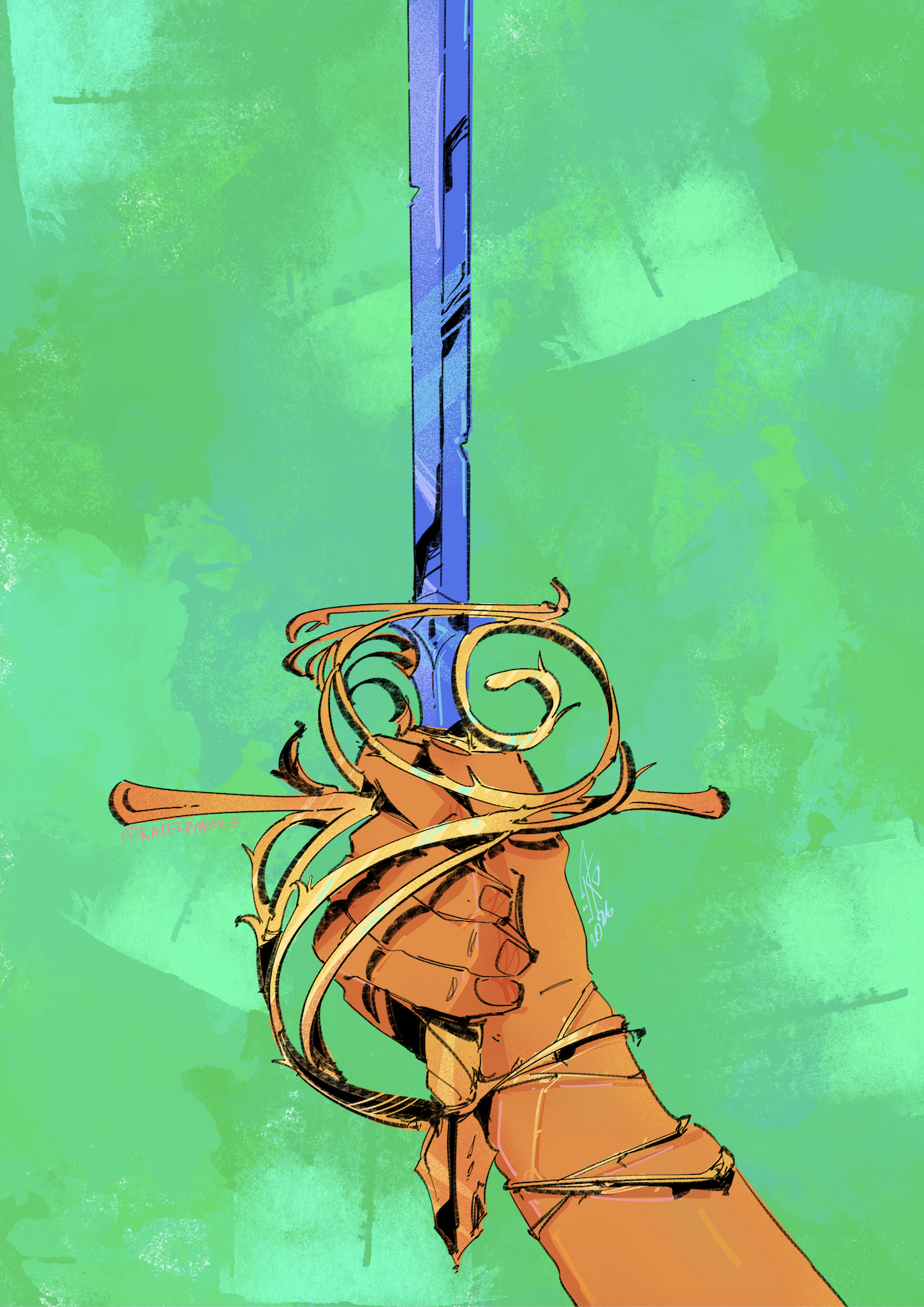
Thorns
Digital illustration
A3 — 29.7 × 42 cm / 11.7 × 16.5 in
Style: Dynamic Semi-Realism
Year: 2026
As an emerging artist based in Brighton, how has living and working there influenced your creativity and artistic development?
Living in Brighton and being a part of its art community let me experience so many diverse art styles. Especially the nonprofit organisation “Draw”, where I was able to experiment with many mediums as well as meeting great artists. I am grateful to have had these opportunities, and I am always looking to expand my digital art outlook.
What are you hoping to explore next, and where would you like to take your artistic practice in the future?
I have been developing a graphic novel of my own and cannot wait to share it with my audience. It started with an idea that was deep and personal, and I was cautious of its portrayal through the novel.
Yet, as I continue to shape it, allowing its characters to become increasingly multidimensional and its story to unfold into something truly worth telling, I find myself believing that readers may resonate with this layered exploration of the human condition — our capacity to love and to hate, to seek meaning, and to reach for something absolute.
Can you tell us a little about your journey as an artist and how you developed your style?
I have always been drawn to bold colours and sharp lines. My style developed through studying comic book art and animation, particularly the work of X-Men artists and Jim Lee. Over time, I have developed my own style, shaped by my interest in expressive characters, strong contrasts and visual storytelling.
Your work is full of bold colours and expressive characters. What inspires your visual style?
The comic and animation work of Gigi Cavenago has always been a major inspiration for me, especially his work on the Dylan Dog series. I’m particularly drawn to the way he creates atmosphere through expressive linework, composition and contrast, while allowing the imagery to carry its own sense of narrative.
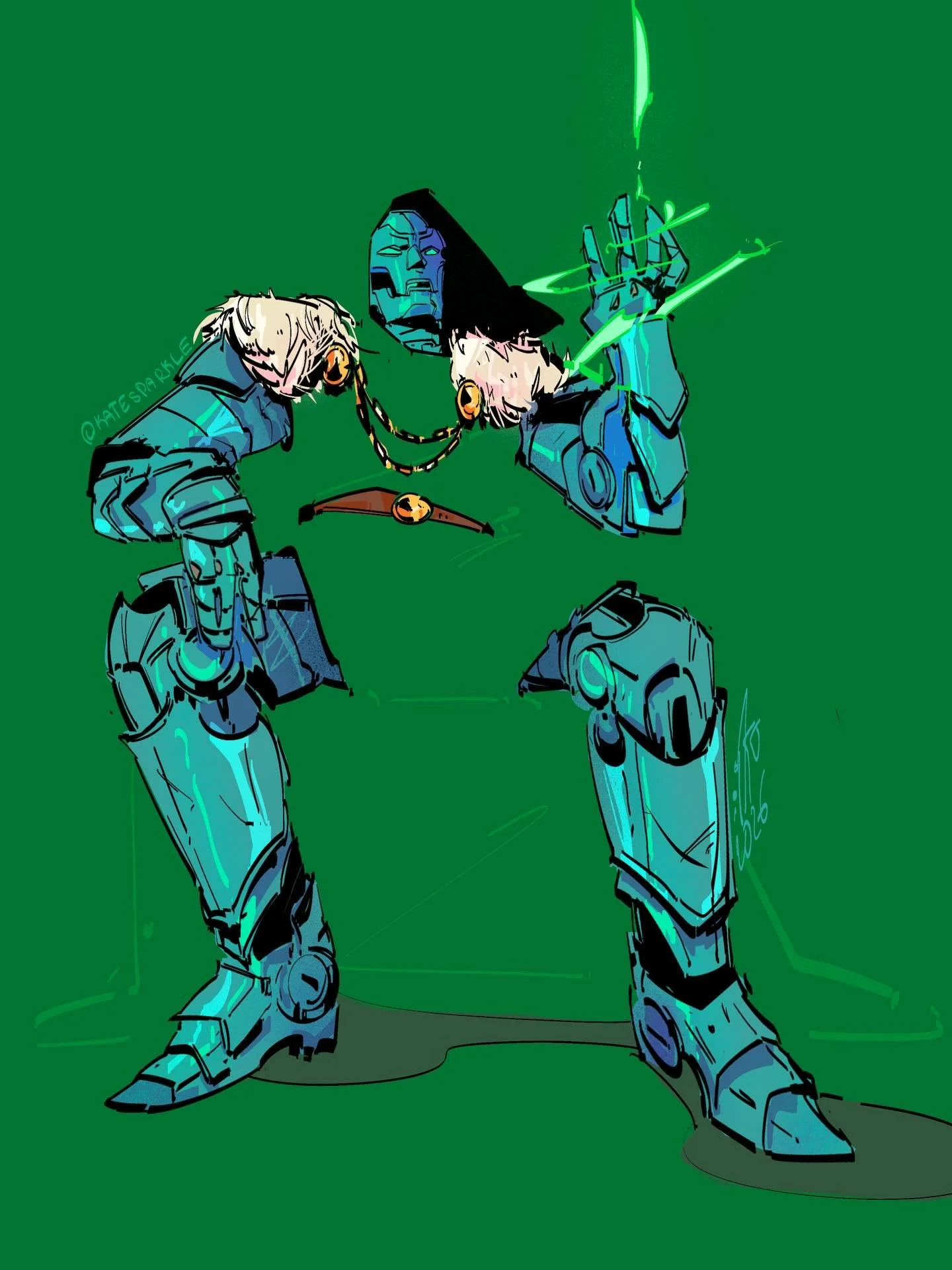
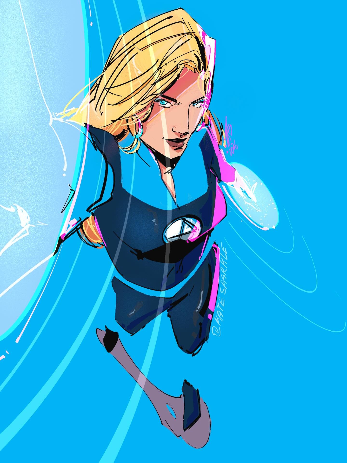
What themes or ideas do you enjoy exploring through your art?
I love exploring the ideas of contrast in my art, like good vs evil, soft vs sharp, hot vs cold. I’m interested in the space between opposites and in how one can change the way we perceive the other. Something can appear beautiful until we look closer, or something that initially seems threatening can reveal a more vulnerable side. For me, these contradictions are what makes visual storytelling so fascinating.
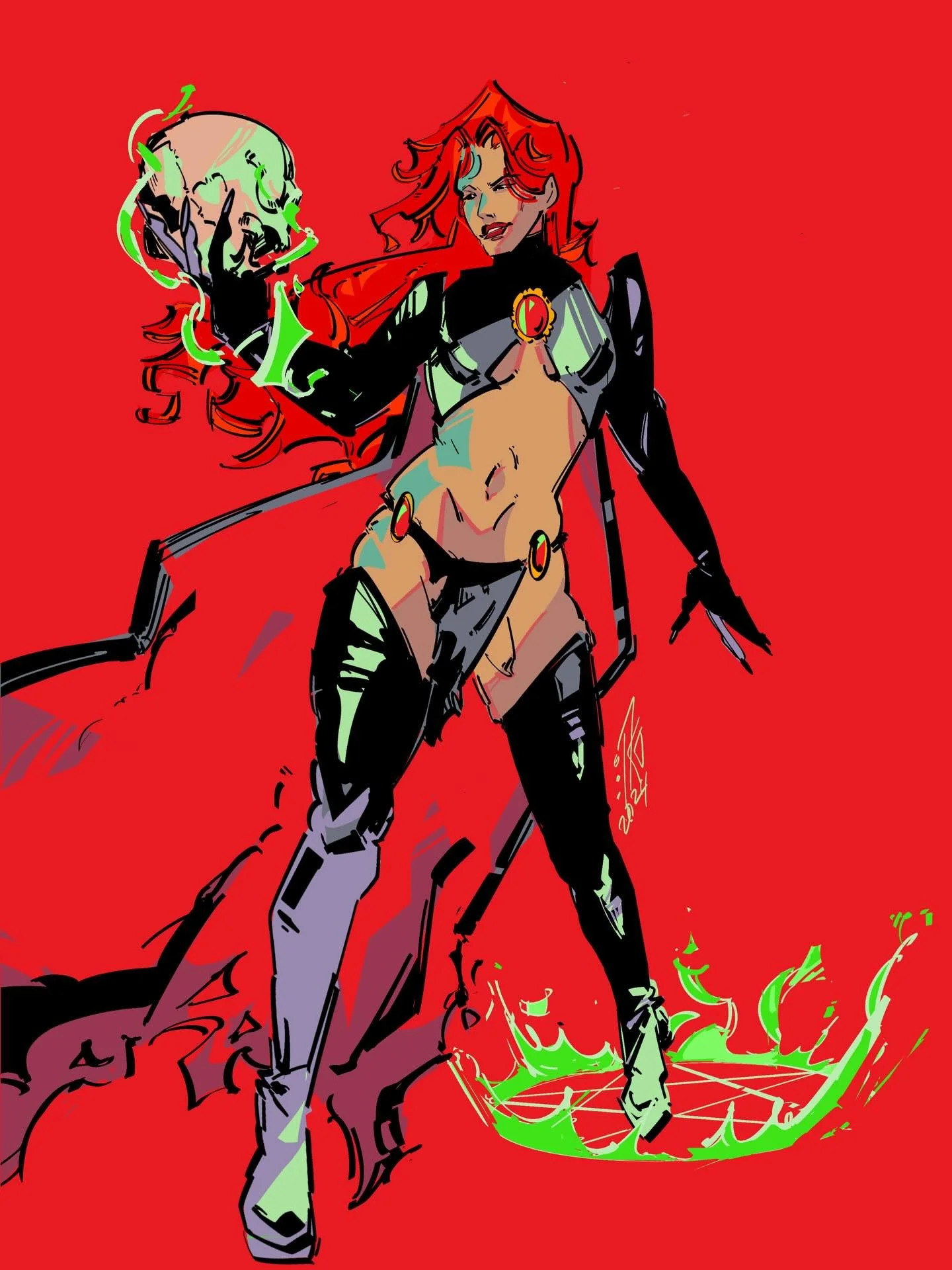
“Toxic” is such a striking piece. What inspired this artwork, and what does it mean to you?
For my art piece “Toxic”, I was inspired by leather spiky boots fashion and the bright pink to go in contrast to it. This work means feminine power, with the addition of small soft details like the lace stockings. I hope viewers bring their own perspectives to “Toxic” and find their own unique meaning within the piece.
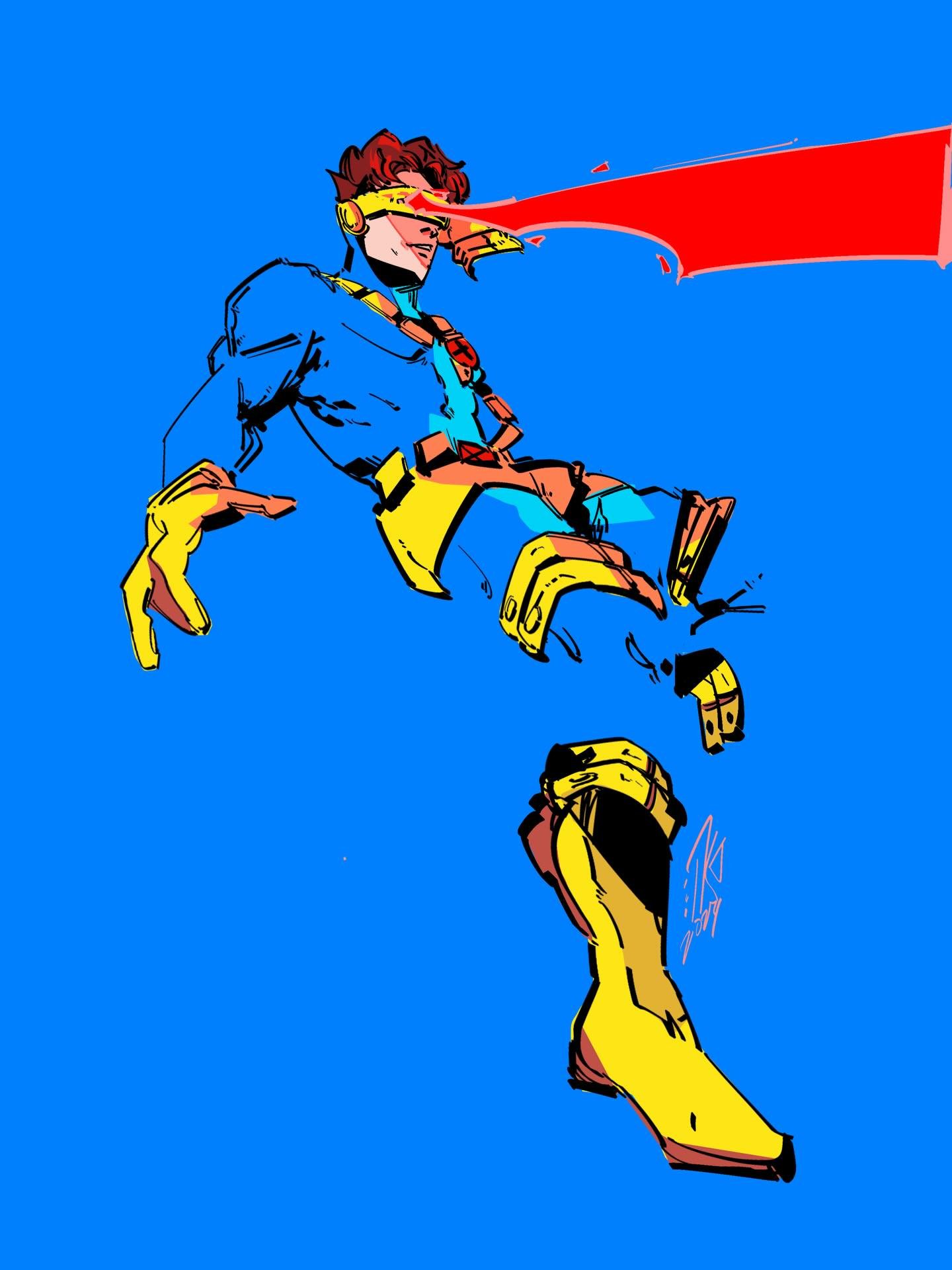
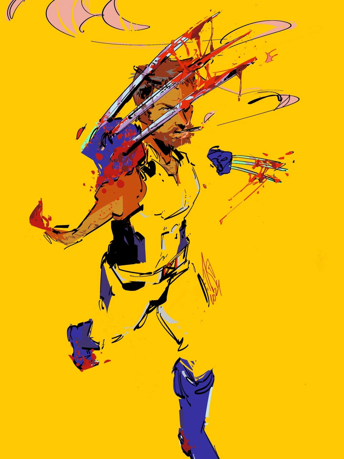
What are you currently working on, and what would you like to explore next in your practice?
I am currently working on my graphic novel and hope I will be able to share it with my audience and anyone who is eager to explore deep senses of confusion, blurred lines between good and evil and how looking at it from different perspectives totally changes the narrative.
I’m particularly interested in how perspective can transform a story. The same action can appear entirely different depending on who is looking at it, and sometimes there is no single interpretation that can fully contain the truth. I think this uncertainty is an important part of being human.
I find much of my artistic meaning in exploring contrast — not only through colour and linework, but also through emotions, relationships and human behaviour. In my graphic novel, I want to bring these ideas together through storytelling and visual cues, using colour and linework.
I hope to share this work soon. More than anything, I want it to become a thought-provoking experience that leaves a lasting impression on everyone it reaches.
Follow Kate on Instagram → @kate_sparkle_art
